 Looking at Things From a New Angle
I think there has been a change in how many people look at things in the Western World. For much of the 20th Century -- up until the 1970's or 80's we were very much driven by paper. If we were doing a report or take notes we would write it on paper that was oriented vertically. Our TV's and movie screens however were oriented horizontally. The current terms used for these orientations -- at least in the world of the Internet, so far as I know -- are 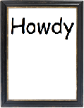 "Portrait" (image to left by DWP¹) and
 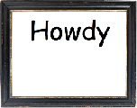 "Landscape" (image to right by DWP¹).
Where this comes important is when video digital terminals and later personal computer monitors came into common use. The terminals and monitors were nearly all in landscape orientation. There were a few notable exceptions I'll get to. This wasn't of great importance until people began to be able to compose documents on the computer or electronic word processor. The screen just didn't fit the printed word on paper. Paper of course normally in publication is in the portrait orientation.
To begin with there was little issue because people wrote on the computer and what they wrote was really not in the same format as what they expected to see printed on paper. Good "word processors" would have a tool for previewing what the printed document should look like and it was okay if this just took up a portion of the landscape oriented screen. Later word processing software and office suites -- to be joined with actual "Desktop Publishing" software -- actually was WYSIWYG  (What You See Is What You Get). That meant that what you saw on the screen more and more resembled what was actually going to be seen on paper and at full size. Of course the screen went one way
 ![]() and the paper the other
and the paper the other![]() . For the most part that has just been accepted and programs have included modes that let you see shrunken versions that will fit on the monitor screen or just let you see a part of the page. Sometimes it is nice to see a two page or even multi-page preview on screen to see how things fit together as a whole document.
. For the most part that has just been accepted and programs have included modes that let you see shrunken versions that will fit on the monitor screen or just let you see a part of the page. Sometimes it is nice to see a two page or even multi-page preview on screen to see how things fit together as a whole document.
Apple did take a step forward with their 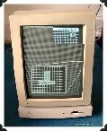 Portrait Display for the Macintosh²³ (image to right - image from "myoldmac.net"). It was monochrome like the original Macs and since so were printers at the time, black print on white screen was just fine. (or many shades of grey) There also was pride on very white screens if I recall the term "paper white screen. There were also monitors developed that would rotate from landscape to portrait orientation. I think that the portrait oriented monitors were/are mostly used by people who do a lot of desktop publishing.
With the ability to have multiple monitors hooked up to computers now and shared desktops and so forth, there is a resurgence in use of 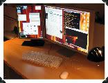 portrait oriented monitors. (image to left - image from "MacNN Forumsª") Probably the new thin designed screens also makes it easier to design and implement considering the lighter components inside without the hefty cathode ray tube (CRT) and transformers.
Note how the second portrait monitor fits so nicely to the left of the main, quite large monitor.
Consider this though: will there be a bias when people design pages, for them to design to the landscape page more often now than the portrait? I got to thinking about that a few years ago when designing event posters for the museum I volunteer at. (The Port Moody Station Museumº) I was designing the posters to fit on regular "letter" sized paper and thought about how we orient such stuff on the paper. Often maps will go landscape while small posters go portrait. When people put together websites although the screen tends to be landscape, the pages tend to either be designed to fit one page landscape or extend portrait style.
 I was wondering if people seeing more and more things in text on a landscape screen would be tending to design documents on that landscape orientation? I know some things just fit better one way or the other. Many people do read things more easily in narrower columns so a wide page is a problem. (Sorry but I can't cite a source at the moment on that, it is something told me by teachers and I have read in articles on learning disorders. It has to do with the eye skipping up or down a line more easily on long lines.) But a wide page can take multiple columns like the news papers have.
Still I think people are more used to scrolling down a long web page than across one. Though the trackpad on my Macbook and the MightyMouse I bought for it can scroll horizontally with equal ease, most mice I have come across are intended to scroll vertically. I wonder though if younger people have less bias against horizontal scrolling and horizontally presented pages? Of course... do people have any bias at all in either direction? .
Later!
~ Darrell
134.
__________
¹ "DWP" -- That's me.
² "myoldmac.net -- Apple Macintosh Portrait Display -- Buy it!"
³ "Apple Portrait Display" MonitorWorld.com.
ª "The New Power Mac Picture Thread -- Page 13" blakespot; Sept 29, 2006, 6:00 pm: MacNN Forums
º "The Port Moody Station Museum Blog" 2734 Murray Street Port Moody, British Columbia, Canada (604) 939-1648 run by the Port Moody Heritage Society


 Stumble It!

No comments:
Post a Comment